Social media post design is judged at a glance, at thumbnail size, before anyone reads a word of the caption. Three checks catch most of what goes wrong: one message per frame, text that clears a real contrast floor, and a layout that repeats next week without renegotiation.
Most advice on this subject is a gallery. You look at forty attractive posts, feel worse about your own, and still have no way to judge the one you are about to publish. What follows is the opposite: a short list of checks a post either passes or fails, in the order worth running them.
What Social Media Post Design Actually Decides
Social media post design is the layout, type, colour and cropping of a single graphic, decided so that one message survives the size and the context it will first be seen in. It is not the caption, the schedule, or the idea itself. It is the frame the idea arrives in.
That frame decides one thing, and it is not beauty. It decides whether a stranger scrolling past registers what you are saying and who is saying it, in the moment before the thumb moves on. Everything else in a design brief sits downstream of that. How those frames hold together across a whole feed is a separate job, covered in our guide to social media graphic design that looks like your brand.
One Message per Frame, and a Caption That Carries the Rest
Decide the single claim the graphic has to land, then cut everything that is not it. A second sentence competing for the same glance does not add information, it splits attention, and both halves lose. If the point genuinely needs two beats, that is a carousel or a second post, not a busier frame.
There is a practical reason to keep the graphic sparse that rarely comes up in design advice. Text baked into an image cannot be resized, recoloured, or read aloud by the reader's own software, which is why the W3C's guidance on images of text asks you to use real text wherever the technology can achieve the same presentation. On a social platform it usually cannot, so the caption is where the real text has to live. Write the message into the caption as well as onto the graphic, every time. It costs a line, and it is the difference between a post that is legible to everyone and one that is decorative for some.
The Legibility Floor Every Post Has to Clear
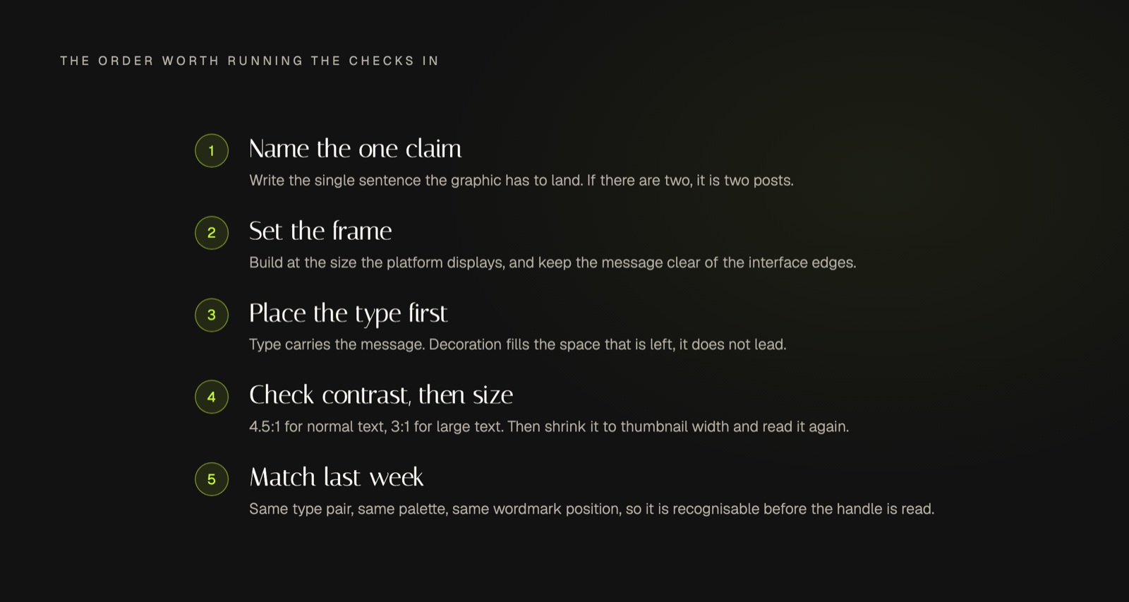
Contrast is the one part of this you can settle with a number instead of an opinion. The W3C sets the working floor at a contrast ratio of 4.5:1 for normal text, and 3:1 for large text, where large means at least 18 point, or 14 point when the type is bold. Brand palettes fail this constantly, usually a pale accent colour sitting on white, or white type dropped onto a photograph with a bright patch in it. Test each colour pair once, write the passing pairs into your design rules, and stop relitigating the question every week.
Size is judged the same way, just without a standard to lean on. Export the post, shrink it to the width it actually occupies in a feed on a phone, and look at it from arm's length. If the line you most need read is not readable, the type is too small, whatever it looked like on your monitor. That test takes two minutes and it catches more failures than any amount of taste.
Keep the message clear of the edges while you are there. Every platform lays its own interface over the frame, and a caption crop or a profile chip landing on your key line is a failure that happened after you exported.
Make Social Media Post Design Repeatable
A single well-made post is worth very little. Recognition comes from the fiftieth one looking like it came from the same place as the first, which means the decisions have to be made once and then reused: one type pair, one palette, a fixed position for the wordmark, one treatment for photographs. Those settled decisions are what let one idea stretch across a week of posts without each one being designed from scratch.
The test is easy to run and slightly uncomfortable. Put three of your recent posts side by side and blur the words. If you cannot tell they belong to the same brand, the visual system is not doing its job, and no individual post will fix that. Consistency here is a systems problem rather than a talent problem, which is also why it survives a busy month when inspiration does not.
Social Media Post Design FAQ
How do you design a social media post?
Start with the one claim it has to make, choose the frame the platform will actually display, then place the type before anything decorative. Check the contrast, shrink the export to thumbnail size to check legibility, and confirm it carries the same signature elements as the last post you published. Decoration is what you add if space is left over, not the place you begin.
What makes a good social media post design?
It is legible at the size it is seen, it says one thing, and it is recognisably yours before the reader checks the handle. Those three properties can be checked by anyone. Adjectives like modern or clean cannot, which is why they make poor design rules and endless revision rounds.
What should you avoid when designing social media posts?
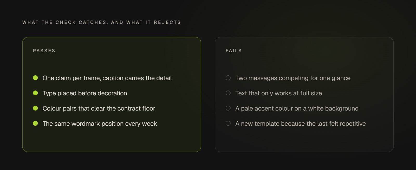
Avoid two messages competing in one frame, type that only works at full size, colour pairs that fail the contrast floor, and a logo enlarged to prove ownership. Avoid changing the template every week as well. Variety feels productive while it is being made, and reads as a different brand each time it appears.
Conclusion
Judge every post against a list you can actually apply: one message, legible type, a colour pair that passes, and the same signature as last week. Then leave the list alone long enough for the repetition to do its work. If holding that standard week after week is the part that keeps slipping, that is the job the Blueprint exists to take off your desk.