Social media graphic design is the practice of building branded visuals sized and styled for a specific platform feed. Done well, it carries recognition: someone should know whose post it is before they read a single word of the caption.
TL;DR: Most small brands fixed their captions and left their visuals generic. Design is what makes a post recognisable, and recognition is what compounds into a reputation. The fix is rarely better taste or a bigger budget. It is a repeatable system: fixed type, fixed palette, fixed layout frames, correct dimensions per platform. Consistency across fifty posts beats brilliance across five.
The Caption Is Solved. The Post Still Looks Generic.
Ask a small business owner what slows their content down and most will say writing. That answer's a few years out of date. Writing tools took the caption from a two-hour job to a two-minute one, and the bottleneck quietly moved somewhere less convenient.
It moved to the picture.
The bottleneck was never really the caption. It is that nobody has the time, or the eye, to design the post the caption sits on. The text problem got solved by tooling. The design problem did not, and it is the one your audience actually meets first.
They meet it fast, too. Research from MIT found that the human brain can process entire images seen for as little as 13 milliseconds. Your post is categorised as familiar or forgettable long before anyone decides whether to read it. That judgment is made on the visual, not the copy.
What is social media graphic design? It is the discipline of producing branded visual assets for social platforms: sizing artwork to each feed's native dimensions, applying a consistent type and colour system, arranging elements so the key message reads first, and doing all of it repeatedly enough that the brand becomes recognisable at a glance.
Notice what is missing from that definition. Nothing about beauty, originality, or artistic flair. Good social media graphic design is closer to signage than to art. Its job is recognition, not decoration.
What Does a Social Media Graphic Designer Do?
A social media graphic designer builds and maintains the visual system a brand posts inside. That means setting type, colour and layout rules, producing weekly assets that follow them, adapting each asset to platform dimensions, and keeping the whole output recognisable over months. The individual graphic matters far less than the system behind it.
That distinction trips people up when they hire. Briefing someone to "make a nice post" gets you a nice post. It doesn't get you the thing that actually pays off, which is the fortieth post still looking like it came from the same company as the first.
The craft splits roughly in two:
- Art direction: deciding the rules. Which two typefaces, which four colours, which three layout frames, how photography is treated.
- Asset production: applying those rules at volume, week after week, without drift.
Most small brands buy production and skip direction. Then they wonder why fifty posts made by the same freelancer still don't look like a brand. Direction is the cheaper half and the half that compounds.
A useful constraint from the usability side: Nielsen Norman Group describes visual hierarchy as organising elements so the eye is guided to consume each design element in the order of intended importance, and recommends keeping to no more than three distinct text sizes. Three sizes. Not seven. Most amateur graphics fail on exactly that count.
The Five Decisions Behind Consistent Social Media Graphic Design
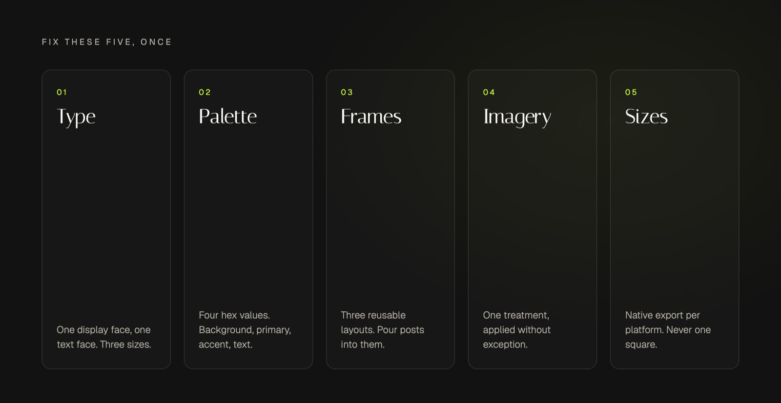
Everything repeatable about social media graphic design comes down to five decisions you make once and then stop relitigating. Make them badly and every post becomes a negotiation. Make them once and the weekly work turns mechanical.
- Type. One display face, one text face. That is the whole system. Adding a third is almost always a mistake dressed up as variety.
- Palette. Four colours maximum: a background, a primary, an accent, and a text colour. Fix the hex values and use them literally.
- Layout frames. Three reusable arrangements, for example a quote card, a single-statistic card, and a list card. New posts get poured into existing frames rather than designed from nothing.
- Image treatment. One rule applied consistently, such as a fixed duotone, a consistent crop, or no photography at all. Inconsistent treatment is what makes a feed look borrowed.
- Dimensions. Build at each platform's native size instead of exporting one square everywhere.
The first four are taste decisions you can settle in an afternoon. The fifth is not a taste decision at all, and it is where most DIY graphics quietly fail.
Legibility is measurable, not subjective. The Web Content Accessibility Guidelines set a minimum contrast ratio of at least 4.5:1 for normal text, and 3:1 for large-scale text. Pale grey captions over a photograph are not a stylistic choice, they are a failure against a published standard. The same guidelines note that people cannot alter how text looks inside images, which is a good argument for keeping words in a graphic short and the real copy in the caption.
Placement follows a similar logic. Nielsen Norman Group's eye-tracking work found that users scan in an F-shaped pattern, where the first few words on the left of each line receive more fixations than subsequent words. Centre-aligned text over a busy background fights that. Top-left, high contrast, short line lengths don't.
Then there are the numbers you cannot argue with:
| Platform | Recommended size | Ratio |
|---|---|---|
| Instagram feed | 1440 x 1800 px | 4:5 |
| Instagram Reels | 1440 x 2560 px | 9:16 |
| LinkedIn post image | 1200 x 627 px | 1.91:1 |
| Pinterest Pin | 1000 x 1500 px | 2:3 |
| TikTok in-feed | 540 x 960 px minimum | 9:16 |
These come from the platforms themselves. Meta specifies 1440 by 1800 pixels at a 4:5 ratio for Instagram feed images. LinkedIn asks for photos at least 552 by 276 pixels, and recommends 1080 pixels wide, while its Pages guidance sets custom post images at 1200 by 627 pixels. Pinterest is blunter than most, warning that Pins with an aspect ratio greater than 2:3 might get cut off in people's feeds.
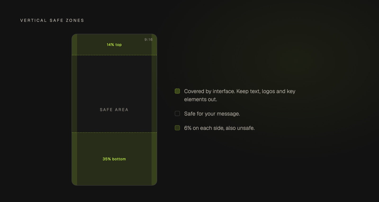
Vertical formats add a trap that catches almost everyone. Interface elements sit on top of your artwork. Meta's guidance for Reels is to keep roughly 14% of the top, 35% of the bottom, and 6% of each side free from text, logos or other key creative elements. TikTok takes the same principle further and declines to publish fixed margins at all, noting that the safe zone is determined by the dimension, the caption length, and any additional formats used. If your headline keeps disappearing behind a username or a button, this is why.
How Much Should a Graphic Designer Charge for a Social Media Post?
Rates vary too widely by market, experience and scope for a single honest number. What is consistent is the structure: a one-off post costs more per asset than a monthly batch, and the real cost driver is volume and turnaround rather than the individual graphic. Ask for a monthly rate covering a set number of posts, not a per-post price.
The comparison people forget to make is against their own hours. Template libraries look free, and they are, right up until you count the evenings. A template hands you a starting point and still leaves you operating the software. Output quality ends up tracking the operator's taste and spare time, which is exactly what the owner of a small business does not have going spare.
So the real question is not what a designer charges. It is which of these three you are actually paying with: money, your own evenings, or the compounding cost of posting nothing. For most service businesses where reputation wins the work, the third is the expensive one and the easiest to ignore.
Will AI Replace Graphic Designers in 10 Years?
Probably not, though it will absorb most routine asset production. AI is already competent at resizing, laying out and generating on-format graphics. What it does poorly is judgment: deciding what a brand should look like, and holding that decision steady across hundreds of posts when every individual output could plausibly go another way.
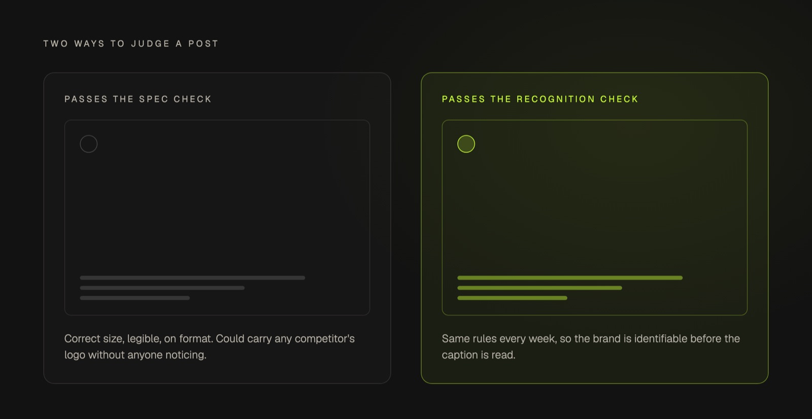
Here is the failure mode we keep running into. Most AI-produced graphics are legible, correctly sized, and completely interchangeable. They pass a spec check and fail a recognition check. If your post could carry a competitor's logo without anyone noticing the swap, the design did not do its job, however clean it looks.
A graphic that could belong to any brand in your category has technically succeeded and practically failed. Recognition is the only metric that survives contact with a scrolling feed.
That gap is not a model quality problem. It is a memory problem. Generic output is what you get when a system has no persistent view of who the brand is, so it defaults to the average of everything it has seen. Give it a fixed set of constraints, the same two typefaces and four colours and three frames every single week, and the same technology stops producing wallpaper and starts producing a brand.
Which is a longer way of saying the interesting question was never whether AI can design. It is whether anything in your setup remembers what you decided last month.
Building a Social Media Graphic Design System You Can Repeat
Consistency beats individual quality, and it is not close. A repeatable visual system that is merely good compounds into recognition. A run of individually beautiful but unrelated posts does not. Recognition gets built by the sameness, not by the highlights.
There is some evidence for this beyond intuition. Marq, formerly Lucidpress, surveyed brand management professionals and reported that respondents expected a 10 to 20 percent increase in overall growth from consistently maintained branding. The same research points at the reason it rarely happens: while 85% of organisations have brand guidelines, only 30% are consistently enforced. Almost everyone has the rules. Almost nobody applies them at the speed social demands.
That gap is a systems problem wearing a discipline costume. Nobody breaks their own brand guidelines on purpose. They fail because it is Thursday, the post goes out tomorrow, and opening the guidelines document costs more than eyeballing it.
A workable system is smaller than most people expect:
- One type pair, locked, with sizes fixed at three steps.
- One palette of four hex values, written down where you actually work.
- Three layout frames covering most of what you post.
- One image treatment rule, applied without exception.
- One export preset per platform, built at native dimensions.
Everything above is a decision, not a skill. That's the encouraging part. Treated this way, social media post design stops being a weekly creative act and becomes the application of choices you already made. The per-post version of that is a short list of checks every social media post should pass before it goes out. It is also why capturing those decisions properly matters more than any individual tool: a system that holds your voice, positioning and visual identity in one place is what turns weekly output from a series of judgment calls into a series of applications. The same logic is why one idea can travel across several channels without looking like five different companies wrote it.
Key Takeaways
- Social media graphic design is about recognition, not decoration.
- A viewer should identify your brand before reading the caption.
- Consistency across fifty posts beats brilliance across five.
- Fix type, palette and layout frames once, then reuse them weekly.
- Build at each platform's native dimensions instead of resizing one square.
- Generic AI visuals pass a spec check and fail a recognition check.
Frequently Asked Questions
What Is the 5 5 5 Rule for Social Media?
Definitions vary, but the common version is a posting mix: five posts sharing your own expertise, five sharing other people's content, and five that are personal or behind the scenes. It governs what you post rather than how it looks. The visual treatment should stay identical across all fifteen.
What Is the 80/20 Rule on Social Media?
The 80/20 rule suggests roughly 80% of posts should inform, help or entertain, and 20% should promote directly. It is a content balance guideline. In design terms it argues for one visual system carrying both kinds of post, so the promotional fifth does not look like an advert imported from somewhere else.
How Do You Become a Social Media Graphic Designer?
Most people arrive by one of two routes: a design education followed by social specialisation, or a marketing role where the design work quietly became theirs. The portfolio matters more than the credential, and the strongest portfolios show one consistent system applied across many posts rather than a handful of striking one-offs.
The Bottom Line
The brands that look established on social are rarely the ones with the best individual graphics. They are the ones that decided what they look like, wrote it down, and then applied it every week without renegotiating. Mature social media graphic design looks unremarkable from the outside, which is rather the point. It is a systems advantage, and it's available to a one-person consultancy just as much as to a company with a design team.
Good businesses should not go quiet because Thursday got busy, and they should not have to choose between posting consistently and posting well. If holding that standard every week is the part that keeps slipping, it is worth seeing what a system that does it for you costs.