A brand kit is the set of files and rules that lets anyone produce work that looks like you: logo files, colour values, type choices, layout frames and export settings. It works when a stranger can use it without asking you a single question.
TL;DR: Most brand kits are built to be admired rather than applied. They collect logo files and a palette, then describe everything else in adjectives that nothing can check. A kit earns its name when each element is a rule with a value: a hex code, a ratio, a pixel dimension, a named file. That is the difference between a document you show people and a specification they can work from.
Ask ten small businesses whether they have one and most will say yes. Ask them to send it and you get a folder: a logo in two formats, four colours, and the name of a typeface someone chose three years ago. Hand that folder to a freelancer and the questions start within the hour. Which logo on a dark background? How big is a heading? Does the orange go on the navy, or was that the one that never worked?
The gap is not effort. It is specificity. A kit that names its rules can be applied by someone who has never met you, or by a system that never will.
What Is in a Brand Kit?
A complete kit contains four things: identity files, a colour system with exact values, a type system with named weights and sizes, and the layout and export rules that say how all of it gets assembled. Most kits stop after the first two and call the job finished.
- Identity files. The logo in the forms you actually need: the full lockup, a compact version for small spaces, and a single-colour version for when the background fights you.
- A colour system. Not a mood, a set of values. Exact codes for screen, and a note on which pairs are allowed to sit on top of each other.
- A type system. One or two typefaces, the specific weights you use, and a fixed set of sizes rather than a free slider.
- Layout and export rules. The handful of frames a post is allowed to use, and the dimensions each channel gets built at.
The fourth item is the one that decides whether the other three survive contact with a real week. Colours and logos are the pleasant part of the job, so they get done. Deciding that every carousel uses one of three frames, and that the Instagram export is built at 1080 by 1350 rather than resized from a square, feels like admin. It is also the part that makes fifty posts look related.
If you are starting from nothing, the order matters more than the polish, and we have written a separate walkthrough on how to create a brand kit from scratch that takes the four parts in sequence.
Adjectives Are Not Rules
Open almost any brand document and you will find a page of words like modern, approachable, premium, bold, human. They are pleasant to read and impossible to apply. Two competent designers will produce completely different work from the same five adjectives, and neither of them is wrong, because nothing in the document could have told them apart.
A rule is something that can be checked. Compare the two columns:
- Not "warm and approachable", but "body text sits at 17 pixels, line height 1.6".
- Not "use plenty of white space", but "outer margin is never less than 64 pixels".
- Not "our blue", but the exact value, and the two colours allowed to sit on it.
- Not "keep the logo clear", but "clear space equals the height of the mark on all four sides".
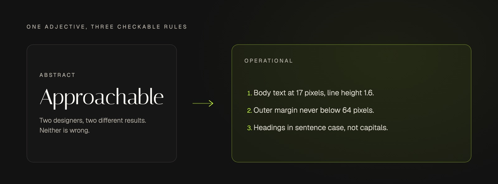
The adjectives are not useless. They explain the reasoning behind the rules, which is what stops the rules being applied stupidly in a situation nobody anticipated. The mistake is shipping the reasoning without the rules and calling the result a specification.
A kit that only a designer can interpret is a kit that stops working the week that designer is busy.
The Five Things Most Brand Kits Leave Out
Across the kits we see, the same five gaps turn up. None of them is difficult. They are simply less enjoyable than choosing colours.
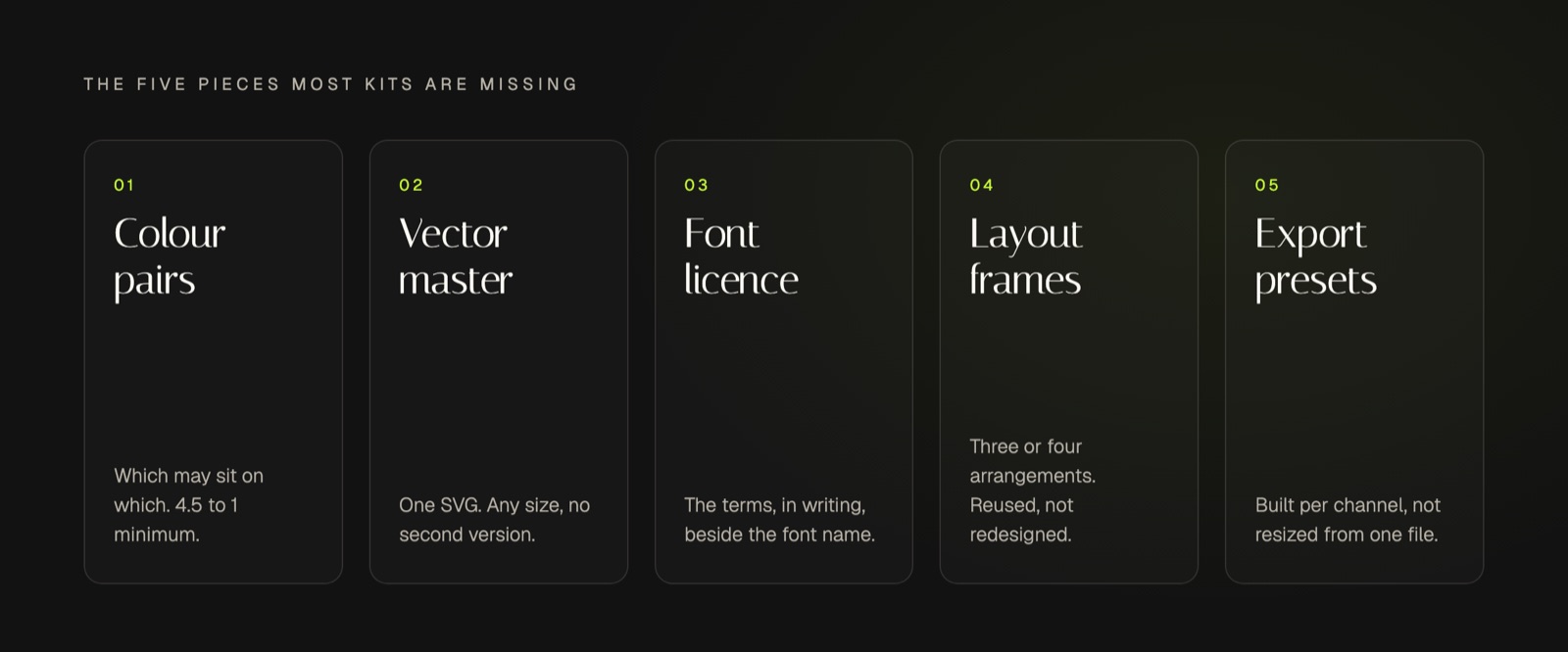
Allowed colour pairs, not just colours. A palette of six colours implies thirty combinations, and most of them are unreadable. The accessibility standard is specific about where the line sits: text needs a contrast ratio of at least 4.5 to 1 against its background, dropping to 3 to 1 for large text at 18 point or 14 point bold. Your kit should name the pairs that pass, so nobody has to test them at eleven at night.
A vector master file. A logo supplied only as a PNG is a logo that will eventually appear blurred on something expensive. Vector formats exist precisely for this: graphics that scale to different display resolutions, so printed output uses the full resolution of the printer and the same file can be reused at different sizes without a second version. One SVG removes an entire category of future problem.
The font licence, in writing. Typefaces come with terms, and "we found it online" is not a licence. An open licence is usually generous: fonts under the SIL Open Font License can be used in books, posters, artwork, logos and on websites with no acknowledgement required, though the licence also lets a designer reserve the font name, which matters the moment someone modifies the file. Write the licence and its limits into the kit next to the font name.
Layout frames. Three or four reusable arrangements covering most of what you post: the quote, the statement, the list, the announcement. Without them every post is a fresh design decision, which is how output slows down and consistency drifts.
Export presets per channel. Built at native dimensions, one preset per place you publish. Resizing one square to fit five channels is the single most common reason a competent brand looks careless.
Templates can close some of these gaps quickly, and they are worth using when they are, but they carry their own trade-off, which is worth understanding before you commit to a set of brand kit templates.
Can You Use AI to Create a Brand Kit?
Partly. AI is good at the generation half: drafting palettes, proposing type pairings, producing variations faster than a person can sketch them. It is not good at the deciding half, because deciding requires knowing your customers, your competitors and what you refuse to look like. Those inputs live with you.
The useful division is simple. A model can widen the set of options and then apply a rule consistently forever, which is genuinely hard for humans and genuinely easy for software. Choosing which rule deserves to exist is judgment, and judgment is the part worth your afternoon.
There is also a failure mode worth naming. A generated kit tends to be internally pretty and externally generic, because the model is drawing on the same reference material as everyone else's. It will pass a spec check and fail a recognition check: nothing is wrong with it, and nothing about it is yours. We have written more on where that line falls in practice for an AI generated brand kit.
Making the Kit Readable by Software
The moment your kit stops being read only by humans, its format starts to matter as much as its contents. Software cannot interpret "our blue, but softer". It can read a named value.
What is a design token? A design token is a design decision stored as a named value that tools can read, such as a colour or a font size written as a name and value pair. The specification for the format describes a token as information associated with a human readable name, at minimum a name and value pair, with optional type and description.
This is not a niche idea. The standard format exists specifically to improve interoperability between tools, so design system teams stop writing custom integration code for every product they use. The underlying principle applies even if you never touch the file format: a decision with a name can be applied automatically, and a decision described in prose cannot.
It is worth being clear about what this does and does not buy you. A set of standards is not the same as a system that uses them. As Nielsen Norman Group puts it, a design system is a complete set of standards intended to manage design at scale using reusable components and patterns, and they are candid that a poorly maintained one becomes an unwieldy collection of components nobody trusts. A kit sitting in a shared drive has the same fate available to it.
What prevents that is having one place where the decisions live and something that applies them by default rather than on request. That is the thinking behind the Blueprint: capture voice, positioning and visual identity once, then let everything downstream inherit it instead of re-deciding it every week. If you want a read on where your current identity is loose before you formalise anything, our brand audit scores the parts that usually drift first.
Key Takeaways
- A brand kit is a specification, not a mood board.
- Judge it by whether a stranger can use it unaided.
- Every rule needs a value: a code, a ratio, a dimension.
- Adjectives explain the reasoning; they cannot replace the rules.
- Layout frames and export presets are the most skipped, most useful parts.
- Named values can be applied by software; prose cannot.
Frequently Asked Questions
Can You Build a Brand Kit for Free?
Yes. Every part of a kit can be assembled at no cost: open licence typefaces, a palette you define yourself, and a written document listing the rules. What you are spending instead is judgment and time. The cost of a paid option is usually someone making the decisions for you, not the files themselves.
How Much Does It Cost to Get a Brand Kit?
It ranges from nothing to several thousand, depending on whether you are buying files or buying decisions. A template pack is cheap and leaves the hard choices with you. A designer costs more and returns a considered system. Be clear which one you are actually purchasing before comparing prices.
Where Can You Find Brand Kit Templates?
Most design platforms ship starter templates, and they are a reasonable way to see the structure of a kit before writing your own. Treat them as a checklist rather than an identity. A template can tell you which decisions to make, but the decisions themselves are what make the result recognisable as you.
What Is the Difference Between a Brand Kit and Brand Guidelines?
The kit is the working set of files and rules used to make things. Brand guidelines are the longer document explaining the reasoning, tone and boundaries behind them. Guidelines persuade and educate. The kit gets used on a Tuesday afternoon when something needs to go out.
The Bottom Line
The test is unglamorous and it works. Hand your brand kit to someone who has never met you, ask for three posts, and count the questions. Every question is a rule you have not written yet. Most brands discover the missing rules are not the logo and the colours, which were settled long ago, but the frames, the pairings and the export sizes nobody thought to decide.
Getting that written down is what turns showing up from a weekly act of taste into a weekly act of application. That is the whole point of a system: consistency stops depending on whether the right person has time this week. If a kit that applies itself sounds like the missing piece of your week, our waitlist is open, and we would rather show you the standard than sell you the promise.